We design and develop distinctive digital experiences that give brands a stronger presence, a clearer identity, and a more compelling way to connect with their audience.
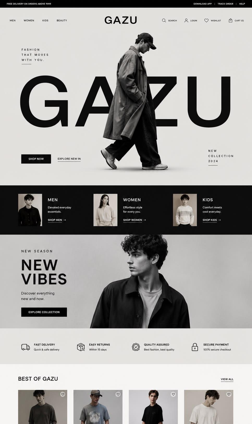
- Gazu
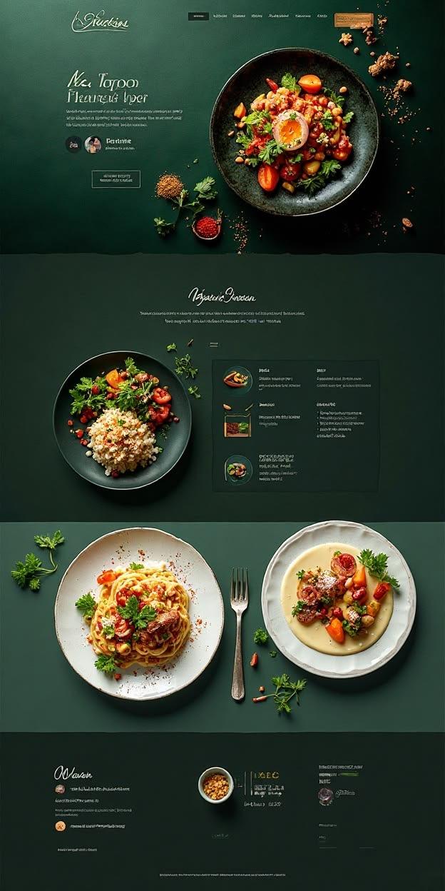
- Green kitchen
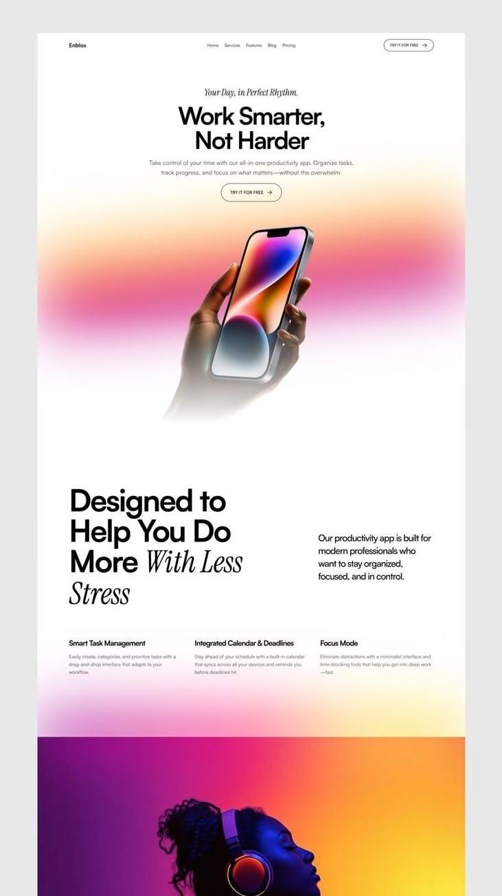
- Work Smarter
One wordmark, one photograph, then straight into the collections. The product is the page.
What we
build.
Every site is designed and developed in the studio, from the first sketch to the last line of code.
- Custom design and development
- Designed from your brand outward and built by hand, not adapted from a template.
- Business websites
- Clear pages that say what you do, show it properly and make getting in touch easy.
- E-commerce websites
- Stores where the product photography and the buying path are designed together.
- Landing pages
- One page, one job: built for a launch, a campaign or the ads pointing at it.
- Interactive and immersive experiences
- Scroll-driven stories, motion and moments people stay for, used where they earn their place.
- Website redesigns
- Your existing site rethought: what to keep, what to cut, and how it should feel now.
- Video-integrated websites
- Film and motion built into the page, encoded and loaded so it plays smoothly on any connection.
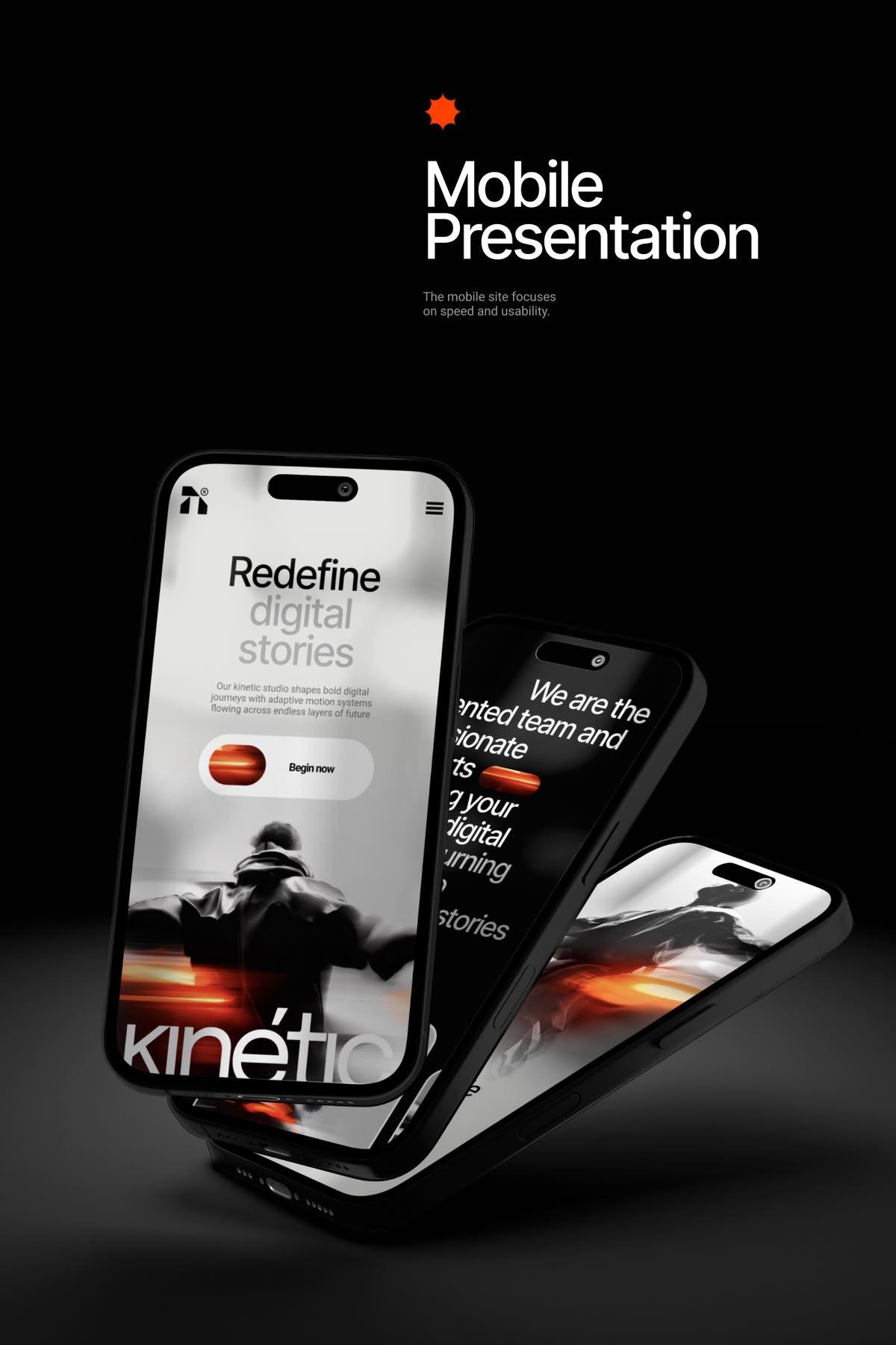
- Mobile-first, responsive builds
- Designed for the phone first, because that is where most of your visitors arrive.
The pictures are
already ours.
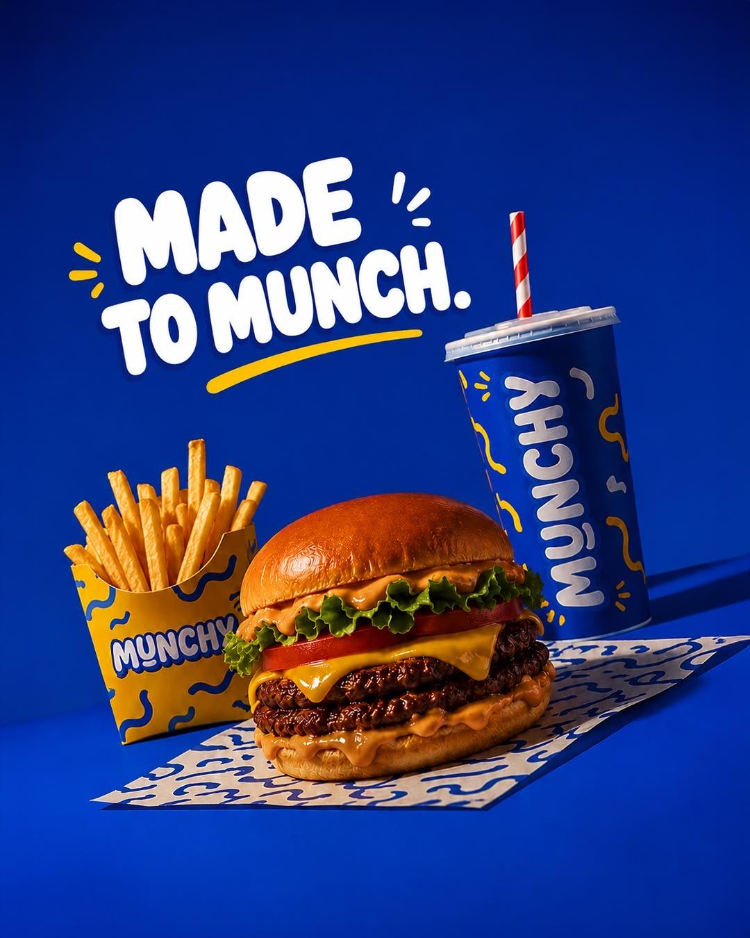
Most websites are assembled by people who didn't make the images in them. Ours are designed by the studio that shoots the product, writes the ads and sets the creative direction.
So the film on your homepage, the photography in your store and the ad that sends people there come from one eye. Nothing has to be stretched, recoloured or apologised for to fit.
From brief to live.
- 1
Structure
What the site needs to say, to whom, and in what order. Pages and paths agreed before anything is drawn.
- 2
Design
The look, the type, the motion and the photography, shown to you as real pages on desktop and phone.
- 3
Build
Developed by hand for speed, accessibility and search, with video and motion that load gracefully.
- 4
Launch
Tested on real phones and browsers, put live on your domain, and handed over with everything you need.